For best experience view desktop version


Improving account creation ease in the onboarding experience of a (mobile) energy app by 43%

Project overview
Through this project, I led the end-to-end redesign of ivie’s onboarding experience by identifying critical user pain points and aligning cross-functional teams around clear design priorities. This project reflects how I approach product design: combining user insight, business alignment, and clear UX thinking to create experiences that are not only intuitive, but also impactful.
The problem
Users were dropping off early—especially at the profile builder and smart meter linking steps. Confusing eligibility questions, unclear messaging, and switching between app and web views led to frustration, incomplete sign-ups, and even duplicate accounts.
My role in the fix
I led the end to end process of redesigning the onboarding including user research and testing, UX thinking and redesign based on research findings and recommendations, mapping and simplifying user journey, UI design
Project outcome
Revamp the designs and account creation flow to reduce drop-off, ease user experience & improve user satisfaction
Process
Following were the different stages of the process but the process itself was not linear

Analysing the problem
-kick off meetings
I gathered existing analytics data and user feedback from customer support and marketing teams that guided the objectives for primary research upon which I relied heavily

Analytics data
Captured analytics on Mixpanel to identify screens with highest drop-off rates in the end-to end onboarding journey
Analytics highlight the highest drop-off at the Smart meter linking screen, raising concerns around unclear messaging, incomplete sign ups, and potential usability or accessibility issues.

User feedback from customer support & marketing
I gathered user feedback and issues raised in completing sign up journey or login journey from our customer support teams
The feedback identified that users struggled with understanding what ivie offers, switching between app and web views, and completing tasks like email verification—often resulting in frustration, incomplete journeys, or duplicate accounts. This helped in planning and scoping out the next step of conducting primary user research.
User testing
I tested the in app onboarding flow with new users using Lookback participate to record the process and encouraged Think Aloud protocol to gain feedback. The interviews were also followed by a survey to gain metrics like SUS score & satisfaction
Research plan
Key objectives & hypothesis
-
What specific usability issues are causing users to drop off at the Smart Meter linking screen?
(e.g., unclear language, confusing steps, or lack of context about the need for a smart meter)
-
Do users understand what ivie offers and why linking a smart meter is necessary during onboarding?
-
What challenges do users face when switching between app and web views during sign-up or login?
-
At what stages in the onboarding or sign-up process do users encounter the most friction, and why?
-
How do users perceive and interact with key features after signing up—and does this align with their expectations set during onboarding?

Research plan as evolved with stakeholder feedback

Research analysis using affinity mapping
Analysis using affinity mapping
Key insights
-
Onboarding Flow Lacked Clarity & Structure
"It would be good to know the steps of onboarding beforehand..."
"Why is it asking me again?"
-
Smart Meter Linking Flow Was a Major Usability Barrier
"What do I have to do next?"
"Is it still loading?"
-
Brand Confusion Between ivie and Chameleon Created Account Issues
"Am I creating an account again?"
"I didn't realise I had a Chameleon account"
-
Information Gaps and Mismatch in Expectations Undermined Trust
"Are these my tariff details or is it taking a guess?"
"I might think the app is not working and delete it."

UX thinking workshops
I led 3 UX thinking workshops with product, marketing, customer support, development and UX teams to align priorities and evaluate feasibility and timeline of solutions to be built
3 workshops
I ran three cross-functional UX thinking workshops focused on unpacking user insights, mapping the onboarding flow, and collaboratively prioritising usability issues.
Teams involved
Stakeholders from product, engineering, design, data, and customer support were involved to ensure diverse perspectives and alignment across functions.
Frameworks used
How Might We, Effort vs. Impact mapping, and User Journey Mapping was used to evaluate opportunities, feasibility, and solution prioritisation.
Key decisions
Simplify the smart meter linking flow, clarify account creation messaging, and restructuring onboarding to build user trust earlier.

Redesign & impact


Old onboarding flow
25 steps to complete sign up
New onboarding flow
14 steps to complete sign up

Key iterations
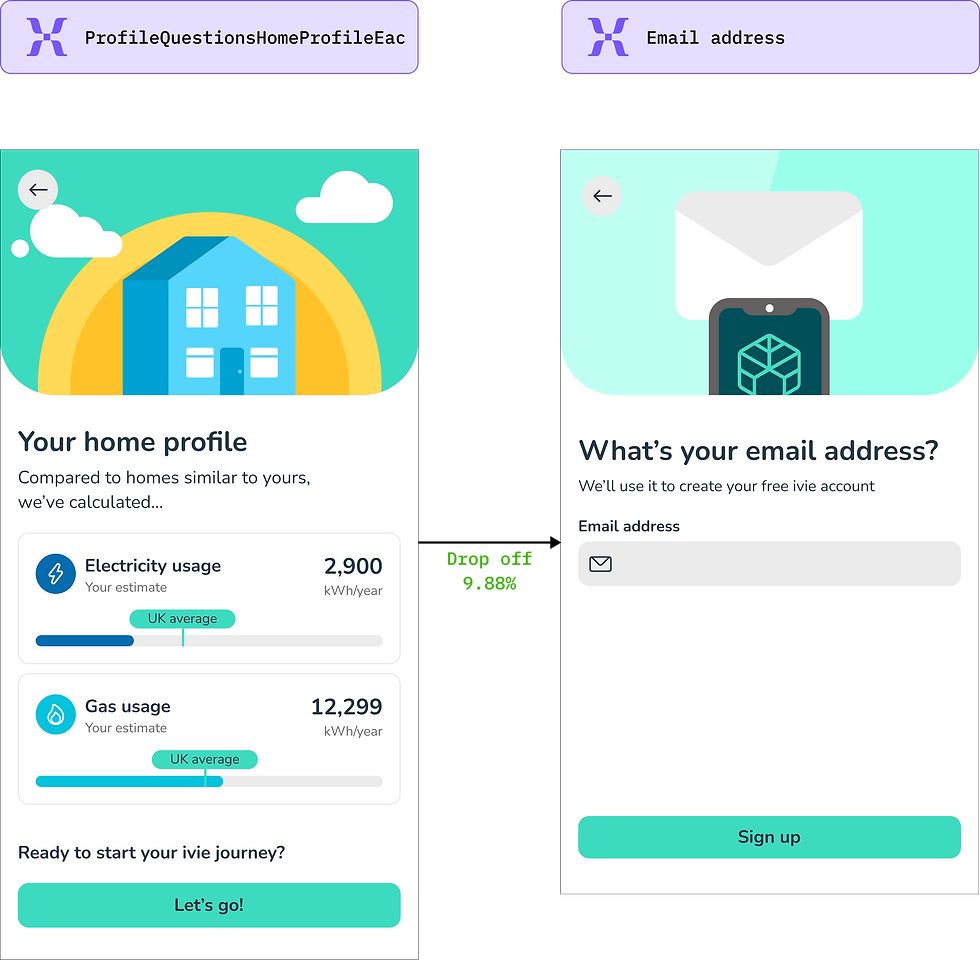
Eliminating the ivie & Chameleon brand confusion by removing the duplicate welcome screen
-
The 2 welcome screens in the old flow caused brand confusion and account creation issues.
-
By removing the second welcome screen, the drop off rate of moving to the next step reduced from 36.85% to 9.88%
Before
After

Improving the usability and clarity of Smart meter linking flow
-
The old smart meter linking screens were 8 steps and had unclear cues and guidance on the next steps
-
The new flow reduced number of screens, improved clarity and visuals
Before
After


Improving account creation ease and clarity of text and error states
-
The old account creation was a 5 step process with unclear messages and structure
-
The new flow reduced number of screens, improved clarity, visuals and error states
Before
After


Next steps
#1
Clarify ivie’s Purpose Upfront
I'll refine how we communicate what ivie does and why it’s valuable—so users immediately understand why it’s worth signing up.
#2
Simplify Key Input Screens
Screens like tariff entry & low-carbon tech selection will be made easier to understand, with clearer language & examples to reduce confusion.
#3
Track Engagement and Improve Continuously
I'll monitor onboarding completion rate, reduction in customer support tickets—and continue refining the experience based on data and feedback.